Downwell is an amazing Roguelike shooter that I could spend countless hours praising, but instead I want to look specifically at its progression system, where you gain experience for going deeper into the well, and are rewarded by obtaining new play styles, and most importantly, more color palettes. These palettes range from the classic black and white with red signifying important objects, to a lovely light blue background with light red outlines in the beautiful Pastel palette. Each one completely changes the game, sometimes for the better, by giving you cheerful colors or colors like Vboy that take inspiration from virtual boy console, and sometimes for the worse, adding unnecessary strain on the eyes compared to the simplistic colors of the starting palette.
Offering color changes as a reward is something that is out of the ordinary, but what fascinated me the most about it was how different the game was in each palette. I found myself making many blunders during some palettes, and gaining amazing progress with others. It also fascinated me because there is an accessibility aspect to Downwell’s palette swaps, and how people who are color blind have different rewards that people who are not.
Usually, during progression, games give you a skill point to use, or ways to make the game easier for you so that you can keep improving. Roguelike games such as Rogue Legacy allow you to gather gold to use on upgrades that are passed on to every character you play as. Each opportunity is the same for every player of these games, they get to choose the upgrades that they want, and their experience is roughly the same, but when you give color options as a way to congratulate you on your hard fought progress, the experience can be very different.
The starting palette of black-white-red should work for everybody who plays Downwell. Making everything black and white and having one color to outline enemies is a great way to make sure that everyone will have an equal opportunity to strive at the game, in other palettes, it can be difficult to distinguish the color of the protagonist with the color highlighting the enemies, and some palettes are not even changed for people who can not distinguish red from green.
After examining the palettes of Downwell using Color Oracle, an application that allows you to see images through different types of color blindness, I realized that Downwell’s palettes failed early on at being accessible, but improved later. The first palette you can unlock is Matcha, and as you can guess, it is green. The worst thing about this choice is that people with deuteranopia, the most common form of color blindness, will not see a difference between the first two palettes. Their experience will be the exact same, while players without deuteranopia will be rewarded with a nice change of color that may interest them more than the original black-white-red palette.

Due to the choice to exchange the red outlines for green outlines in the second palette, people with deuteranopia will have to wait patiently to be rewarded for their first steps into Downwell, and they will already know that the game’s reward system is not noticing their existence. This is where Downwell got it wrong, by setting reward requirements at a different position based on visual ability.
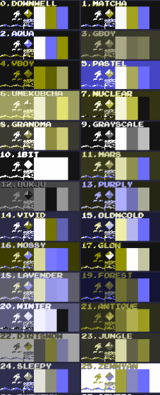
The later palettes found in Downwell do a good job at being color blind friendly and not mixing red and green together, and most of them are different than the ones before them, so the sense of progression still lives. Regardless, having a progression system that is color-based, then there needs to be thought out. Color blind people know that they may not have the same experience as other players, but when the progression is inherently against them, then there needs to be precautions when picking the colors.
Color-centered progression systems are not bad, but they are flawed when it comes to accessibility. Every player should get the same opportunities, and having a system based around something like color, that can be extremely limited for certain people, is not great. I think color is good for creating different tones, and mixing your emotions. When playing with the “Grandma” palette, I feel like I play better because I am more interested in the colors that come with it than the black and white style of the “Downwell” palette. Color is a fantastic thing to experiment with in game design, but experimenting with it by making it a large part of the progression system, a very important system in Roguelikes and virtually all games, is a bad approach.
